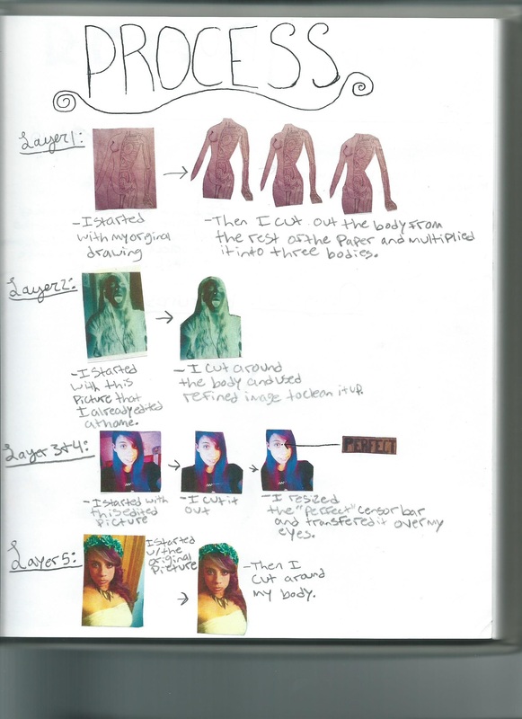
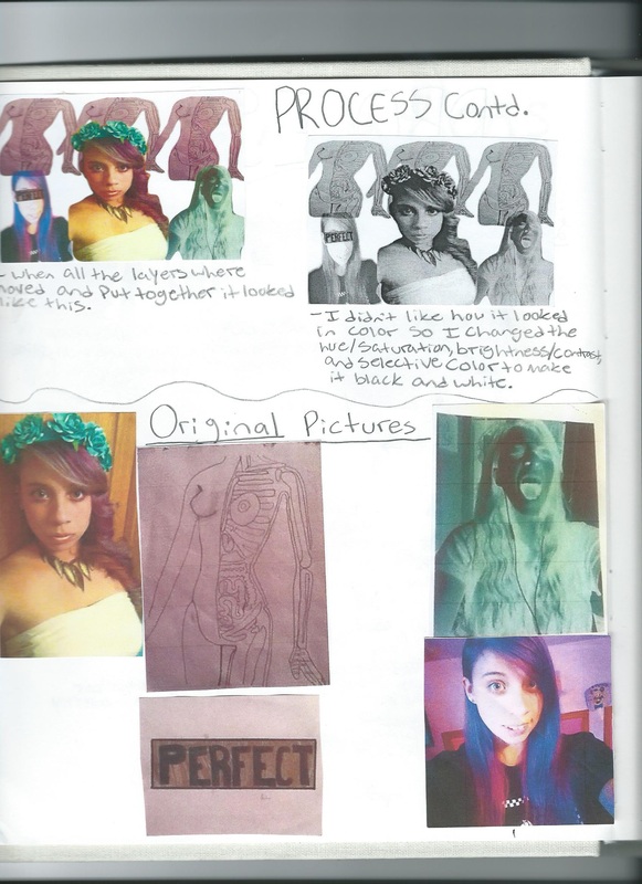
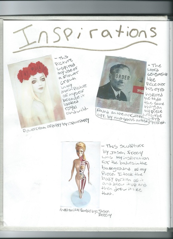
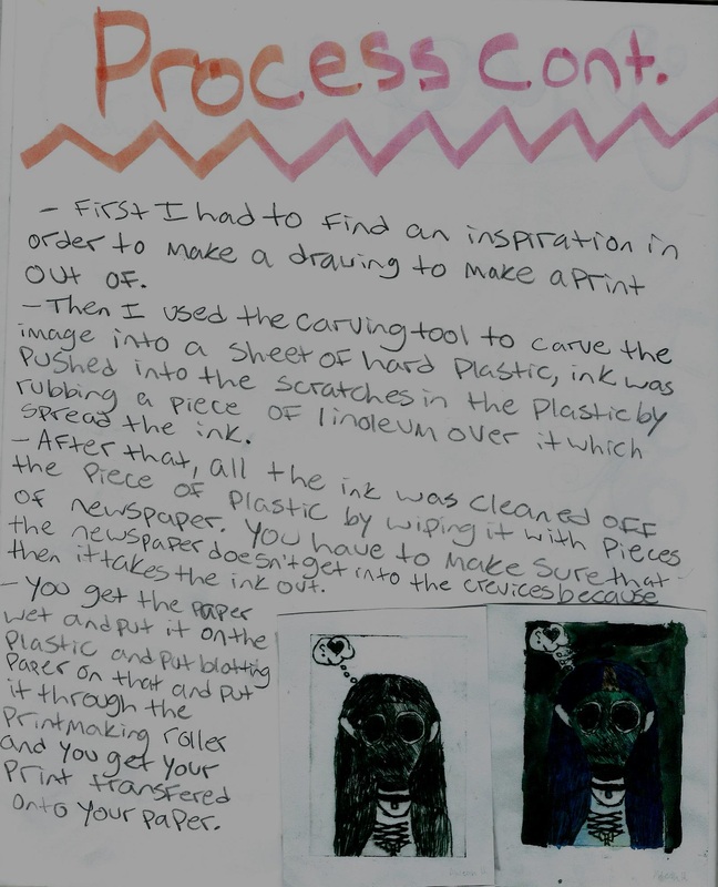
Digital Collage
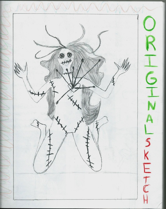
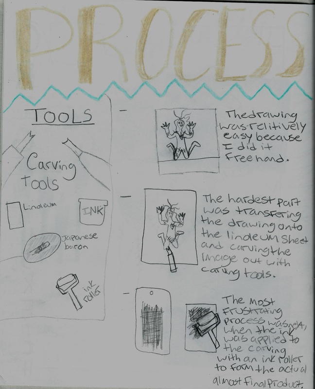
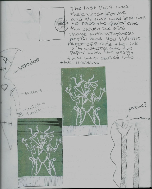
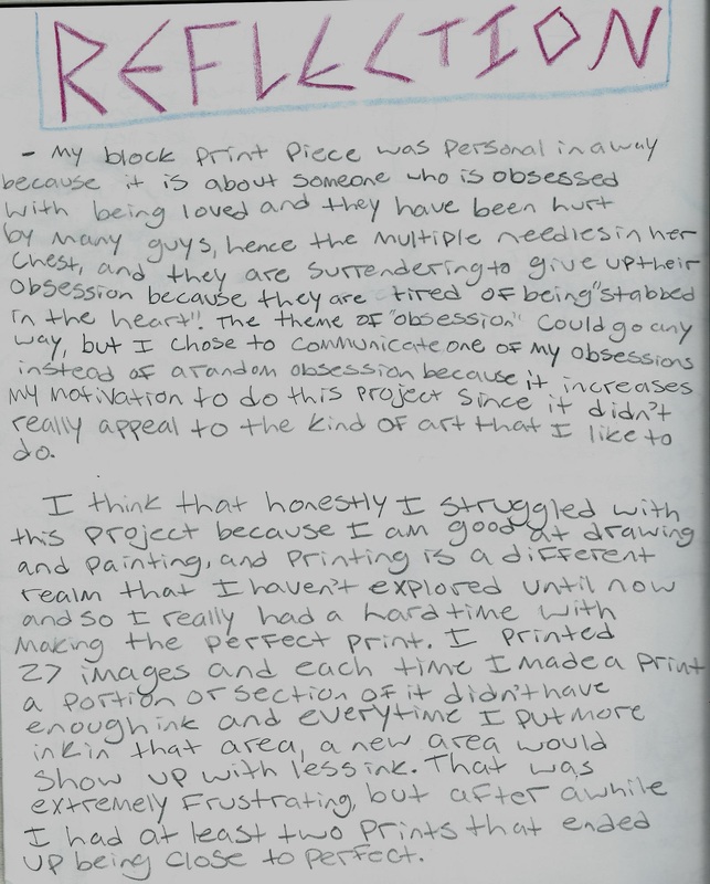
Block Print
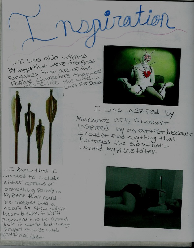
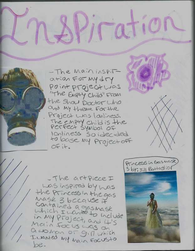
Dry Point
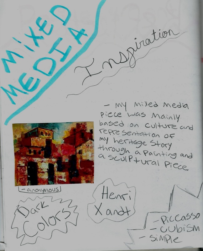
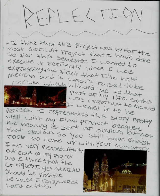
Mixed Media
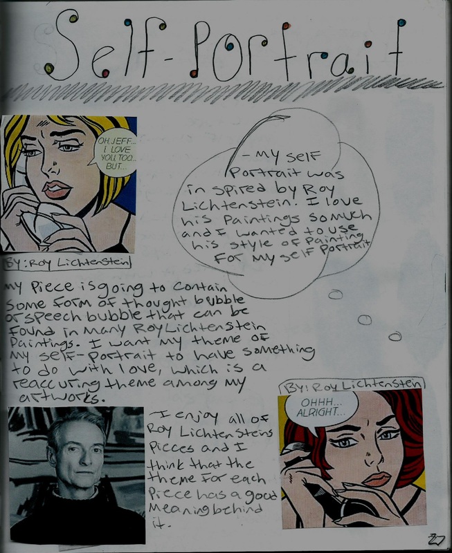
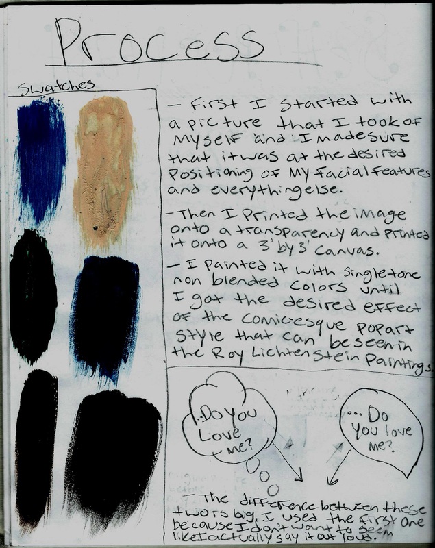
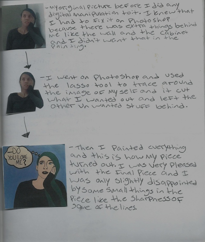
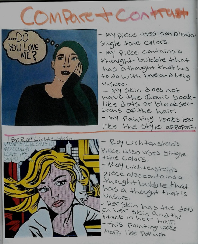
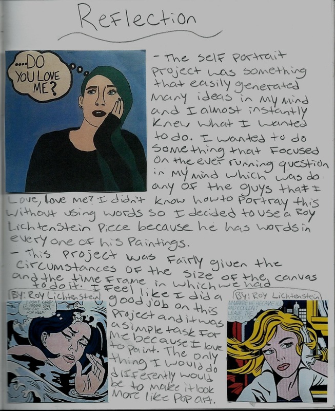
Self Portrait
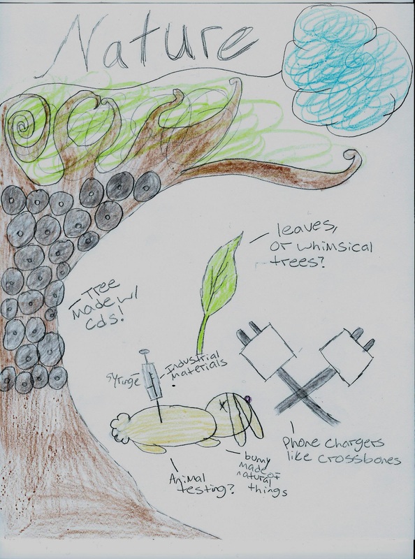
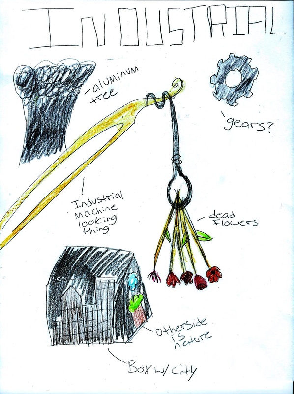
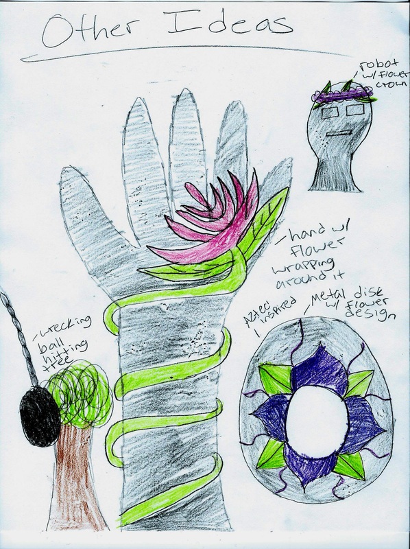
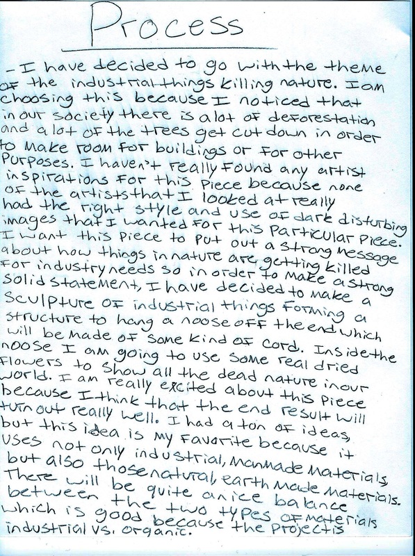
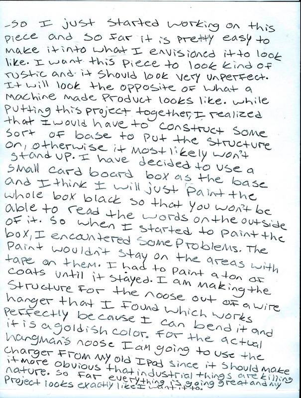
Industrial vs. Organic
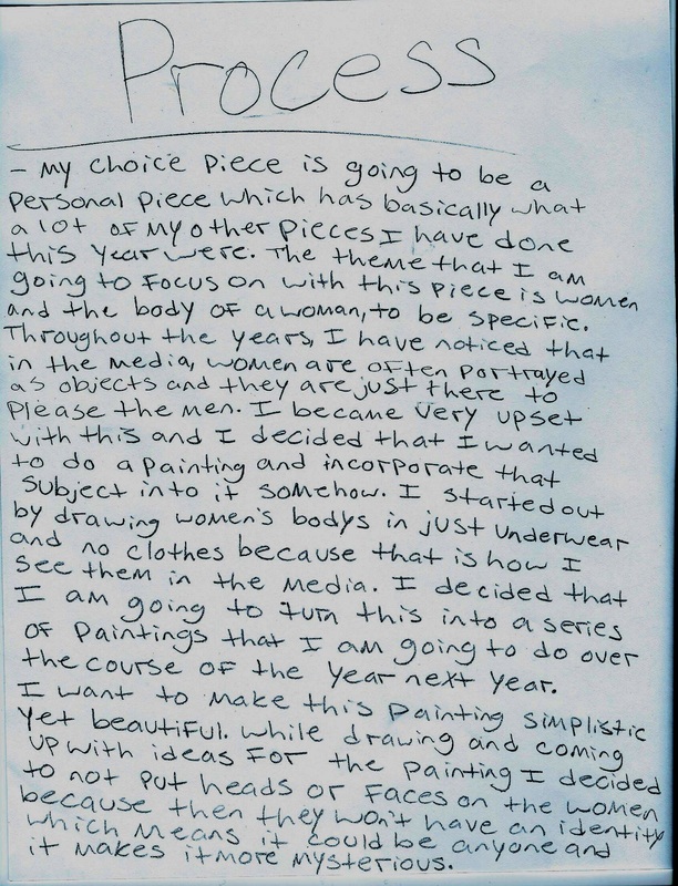
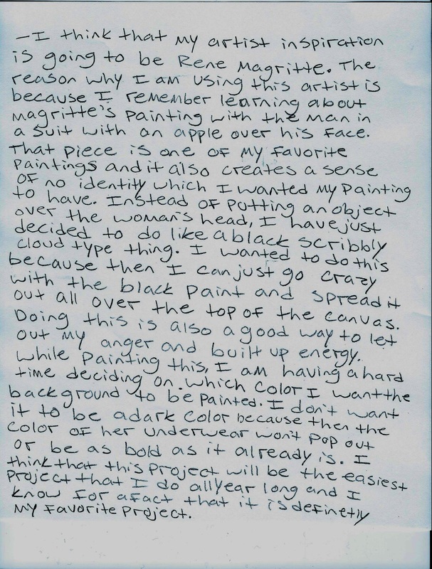
Choice Piece
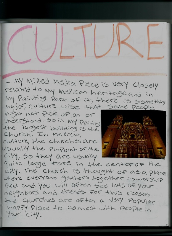
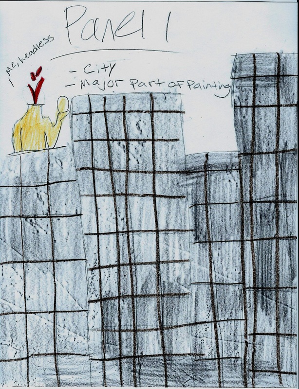
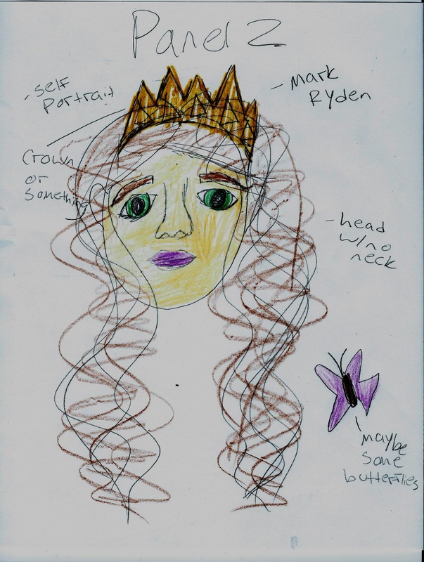
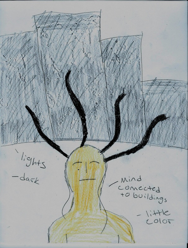
Artist in the City
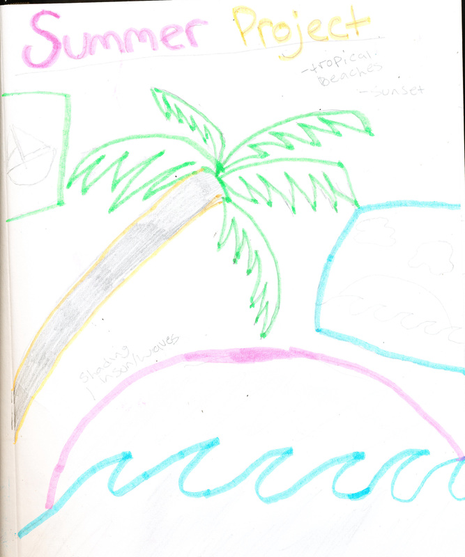
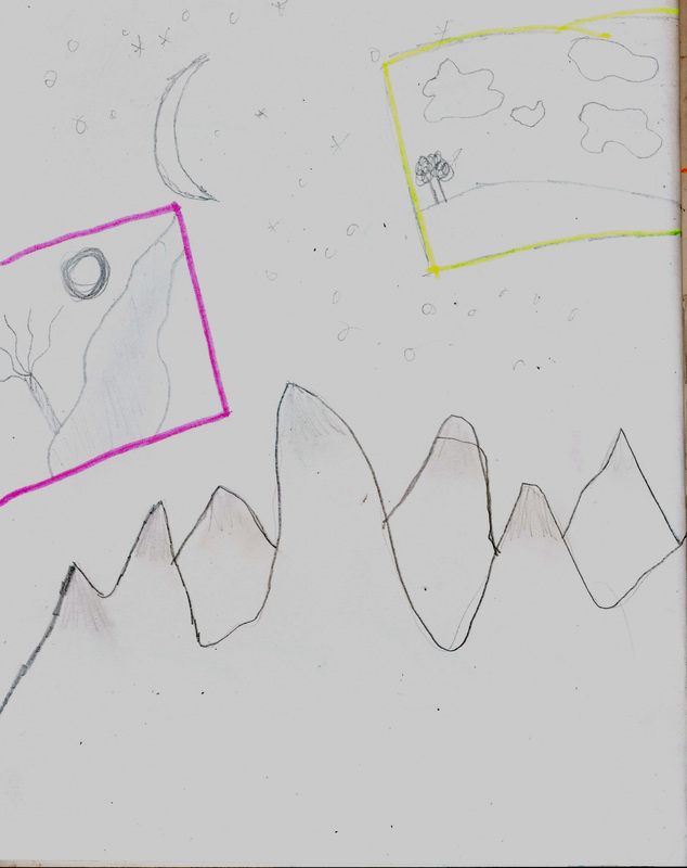
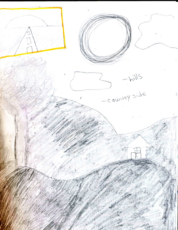
Summer Project
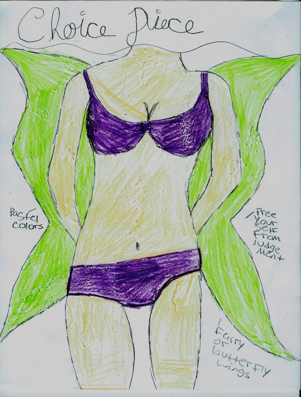
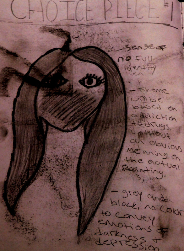
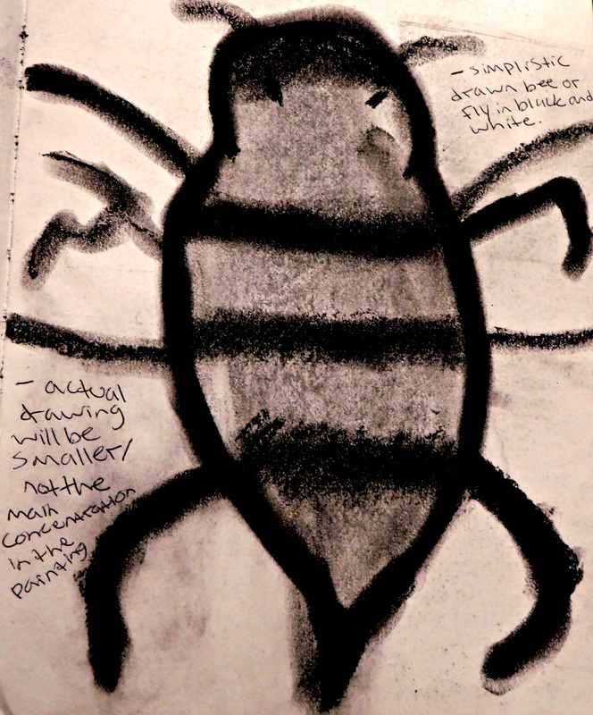
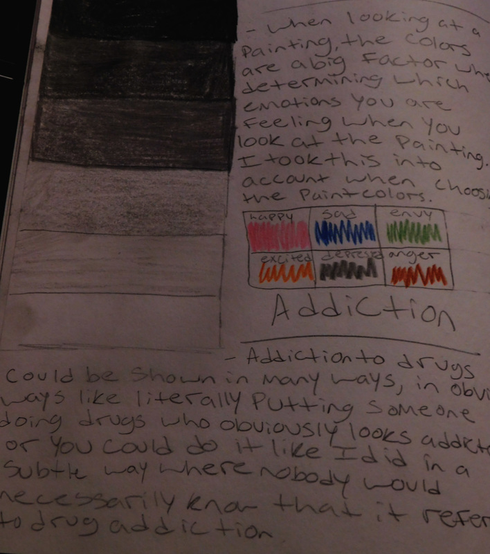
Choice Piece 1
|
The idea for this piece started out when I saw a commercial for drug addiction that was on tv one night. The commercial stuck in my head for two reasons. 1. Because of the message to recognize drug addiction in your teenager. 2. Because the message was delivered in a way that was subtle, which I thought was very interesting because the commercial captured the chaos and disaster that a drug addiction could cause, but it didn't deliver that message in a literal way of someone doing drugs that clearly looked addicted to drugs. They showed a boy chasing a fly around his room while destroying everything in the process of killing it. I loved that commercial because it shows what drug addiction actually feels like and I felt like the fly was the key part to it. This inspired me to make my first painting. I knew that I wanted to have the fly be a part of it because that was the main theme, but I wanted to use the fly as the commercial did in a way that it was subtle, and not the main focus. I wasn't sure what else I wanted to be in the painting, but finally I decided, what better than to make myself the main object in this painting? All of my pieces have something to do with the different parts in my life, and this unfortunately is one of them, if im being honest. I decided to do the painting in black and different shades of grey to convey a different emotion than you would get if i used color. I wanted this piece to ooze depression and regret, my vision for this is to just make you feel sad and empty inside. The line work in this painting is very smooth and clean. I purposely didn't want it to look very sloppy because i wanted to convey that even though you have this addiction that is destroying you, you still try to look clean and perfect on the outside to hide it from everyone. The only thing that i wish i could do differently was to try to do a better job of shading within the face, especially around the nose because i feel like i could've done it better.
|
|
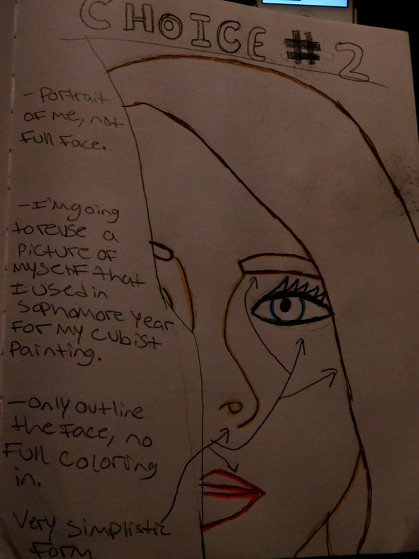
Choice Piece 2
|
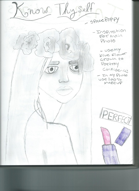
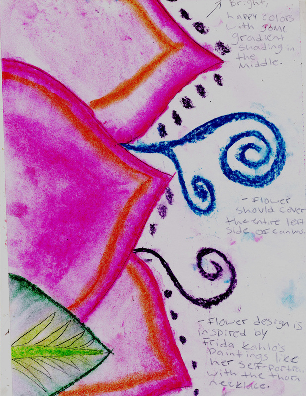
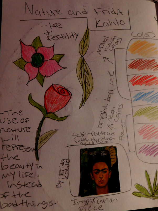
For this piece i knew that i wanted to go in a more happy, natural path. Since all my other paintings are, either serious or sad, i decided that i wanted to portray the part of my life that is actually happy. When i thought of what brought happiness, i immediately thought of nature and being outside. I really enjoy tropical flowers and warm places like Florida, so i figured i would take a pretty tropical flower and make it one of the main focuses of my painting. the other main focus, again, being me since this is a personal series. I was inspired by Frida Kahlo, because in her painting entitled Self Portrait With Thorn Necklace and Hummingbird, i really enjoyed the nature and greenery behind her. Also, her use of bright colors really inspired me. For the flower, i decided to use bold, bright, neon colors. The reason behind that is because the flower represents the beauty of the happy times in my life, so i wanted it to be very bright and beautiful. I chose to paint myself in normal, human-colored shades because i wanted the main focus to be on the flower and not on me. Even though, Frida's pieces are not always happy, i still decided to use her as an inspiration and turn it into something that is happy. The reason why i only outlined the painting with color and didn't fill in the entire thing was because i wanted it to look unique and i've never seen anything like that before. I used a black canvas to paint it on because i figured that the colors i used would look more bold and bright and they would stand out more on a black canvas than on a white canvas. I reused a picture of my face that i used for my Picasso cubism painting during sophomore year because i only wanted a picture with part of my face, and this picture was exactly what i was looking for since i didn't have to cut anything off or re-size it. I was really hoping that there would not be any things that i wanted to fix about this because it is the only piece that i really wanted to be perfect out of my entire series of paintings. I wanted it to be perfect because it is the one painting that i was actually excited about sharing with everyone. the other paintings are so negative and are the parts of my life, so i wanted to make the part of my life that i do actually show off, as good as it possibly could be. i think that i was very successful with this because i feel like if i were to do it again that there would be nothing that i want to fix or change.
|
|
Choice Piece 3
|
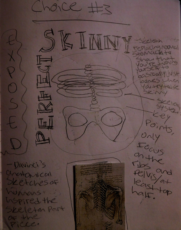
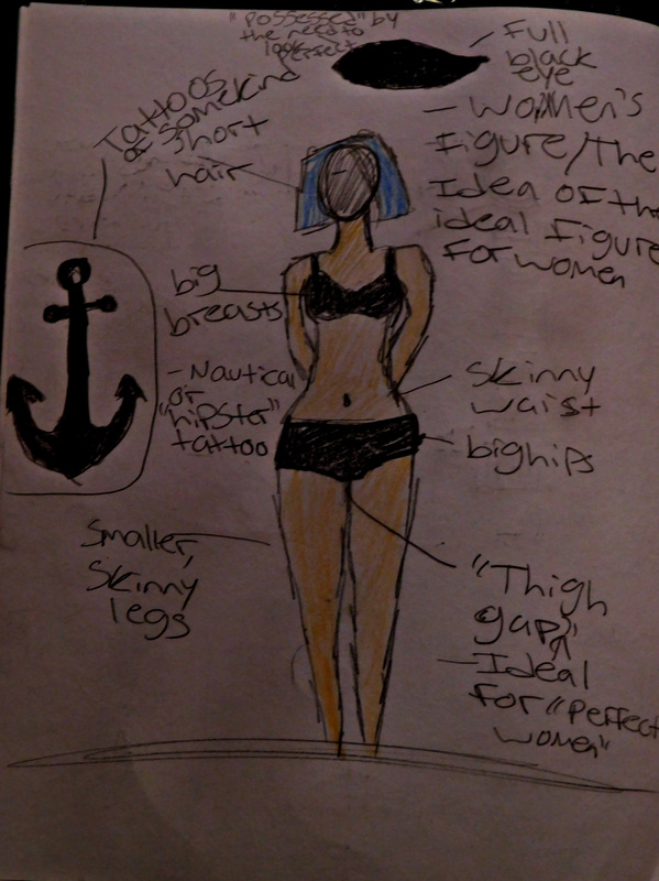
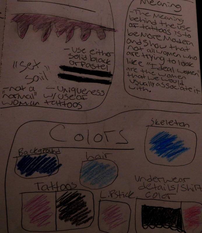
The third painting i did was a huge change from the second painting i did. The emotions and feelings increased back down to seriousness and somewhat of sadness. i decided to go back to a re-occurring topic, which is of the perfect body figure/image for women of today's society. this seems to be a re-occurring topic amongst my paintings because it is the biggest issue in my life and it's like the only thing i know and am good at expressing. this piece is the second largest painting that i have done besides my self portrait from junior year. this painting is hands down my favorite painting to do and i think that it will be my best piece yet. i am working very hard on the painting and it is another painting in which i want as little mistakes as possible because it is a very meaningful painting. for a small segment of this painting, i was inspired by a picture i saw of Leonardo DaVinci's sketch of the rib cage/skeletal system. his sketches really intrigue me and i wanted to do something based on it. i thought it would be perfect to show that you are basically making your body waste away in the process of trying to become skinny or skinnier. the perfect way to portray this idea is to show a skeleton where your stomach and body should be. that is technically what it is anyway. for the woman in my painting, i used a non typical woman with tattoos, pastel hair and piercings to show that even the most unique woman still could have these urges to try and make their body look perfect. i used the concept of contrasting colors to show the difference between the main subject of the painting which was the woman, and the background which is dull and not that attention catching because that shouldn't be the focus. if there was anything that i could change about this piece, it would be to fix some of the lines and parts where some of the colors mixed, otherwise i wouldn't change anything else.
|
|
Choice Piece 4
|
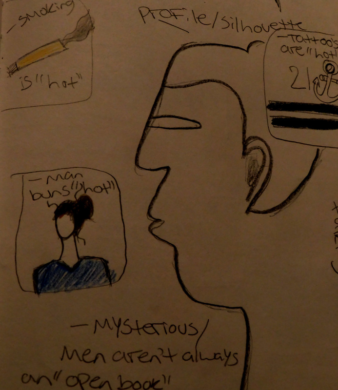
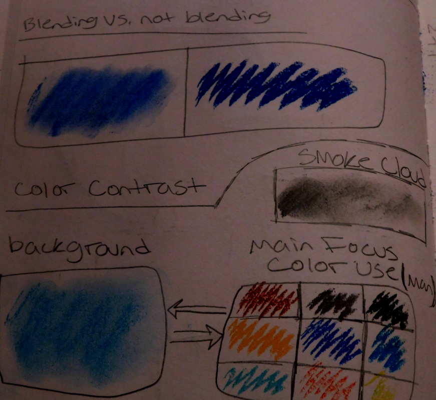
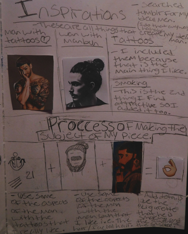
the fourth piece i did is sort of different from the other three. while i did use a similar theme in this piece as i did in the third painting, its different because i used a different medium that i have never used before. this time, instead of focusing on what the ideal woman should be, i focused on the opposite gender and did something on what one of the ideals for a "hot" man are in today's society. while looking on the internet, i noticed that one of the ideal men are men who have tattoos and the new signature "man bun". i don't know what it is about the tattoos and the man bun but i have to agree that it is definitely my ideal man. i decided to make it a little bit more personal by making this man, a man who smokes. even though i don't condone smoking, i still, for some reason think that it's attractive when certain men smoke, i don't know why though. so now that i have the ideas for the ideal man that i am going to draw, im going to sketch a rough draft onto my gesso covered wooden board. i was lucky and did the perfect sketch on the first try. the next thing i did was to add some color by using a blending technique to blend the chalk pastels that i was using. i found that chalk pastels are way easier to work with than oil pastels. coloring in the picture didn't really take that much time, it took about an hour at most. after i had the entire picture colored in the appropriate colors, i started to do some shading and i used the gradient scale to form the smoke cloud. the details and shading were the hardest parts. doing the small details like the tattoos and the facial features were hard because the pastel is basically a wide rectangular prism that has no thin, small edges at all, so it mad it almost impossible to do the small details, this is why it might look a little messy because i was really struggling with it, the shading was kind of hard too because i have never used chalk pastels before so the judgement of how much or little color to add was very confusing. the shading isn't the best either, and i think that if i could go back, i would change the small details and the shading portions of the drawing. i didn't really have any artist inspirations for this piece, all i had was basically that one cultural inspiration/idea of the ideal man.
|
|